Problems with animations
Unlike transitions, which happen between slides and carry no instructional information, animations happen within a single slide and may potentially convey information visually. This becomes an issue when that information doesn't have another method of being conveyed within the PowerPoint. While animations are useful at visually illustrating ideas in a presentation setting, they don't translate to the experience of reading a slideshow with a screen reader.
Beyond the issues with information accessibility, animations also pose issues related to the slide structure. Often, animations are made up of many slide elements that may or may not be visible at different moments in time. If these aren't properly inserted into the slide, reading order issues will cause the slide to be extremely confusing when read aloud. Many times, even if they are properly inserted, there are still redundancies and irrelevant elements that would have to be read. On top of that, even if each element is alt texted properly as well, the elements alone can't convey the overall goal of the slide's visuals.
How to work with animations
Because of the above issues, animations that convey information should generally be avoided when creating a slide show. However, you may be trying to create an accessible version of an existing document, so the rest of this page will discuss how to consider accessibility when working with animations.
The first thing that needs to be considered is what the animation is conveying. Some animations are just having content appear at different times and don't have any informational value. As long as these don't unnecessarily complicate the reading order with extra elements, they can often be left as is. The process becomes more difficult when the animations carry informational content because not only does that information need to be preserved visually, but also conveyed to screen reader users. Animations are a fairly case by case type of issue, and there are a lot of considerations in how they are handled. As such, a few examples are given to demonstrate different ways of dealing with animations and what to consider when doing so.
Minimize unnecessary elements
While newer versions of PowerPoint allow for marking an image as decorative, this is not a surefire way to ensure an element doesn't get read. Because of this, you should always strive to have as few elements as possible.
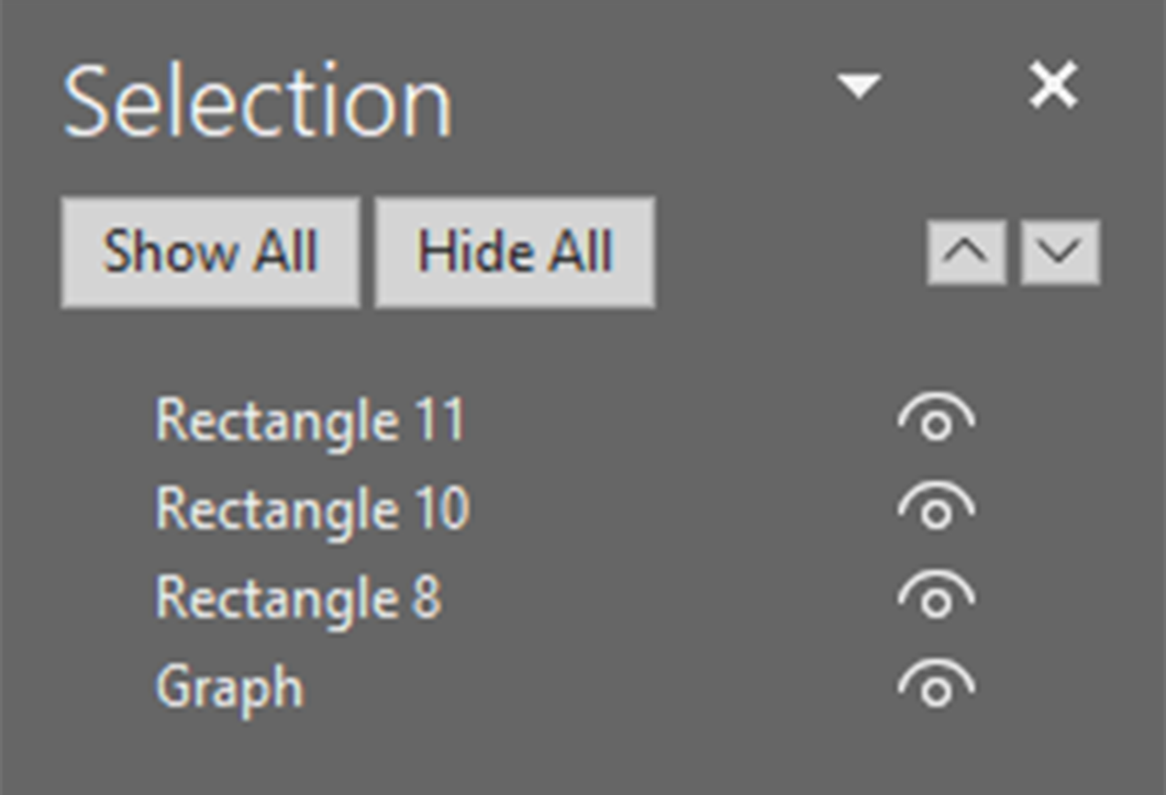
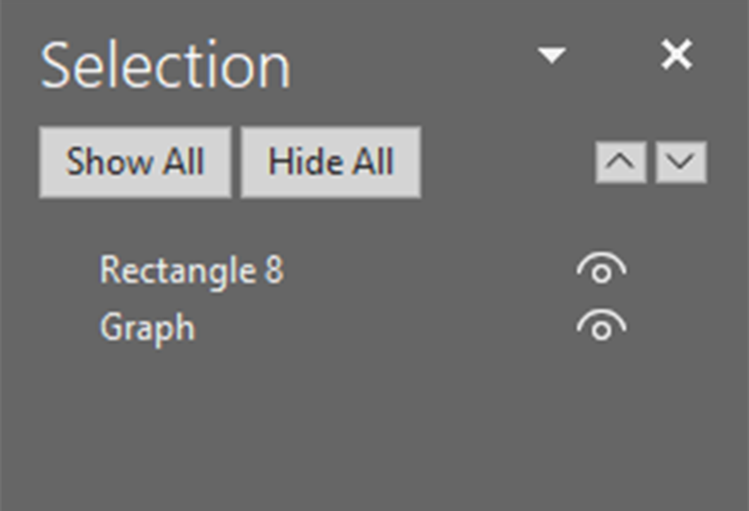
In this example, a graph is being revealed gradually in such a way that an instructor might use to delay showing the later parts of the graph as the earlier parts are discussed. The initial version has three rectangles that cover the graph that each have a fly out exit animation. These extra elements may get read aloud, adding unnecessary difficulty to understanding the slide.

Fig. 1

Fig. 2

Fig. 3
The cleaner version of this has only one rectangle that moves out of the way with a linear motion path and finally exits with a fly out animation. While both of these approaches can result in the same reading order if all of the obscuring elements are marked as decorative, the second version makes it less likely for that step to be forgotten, and if there is an issue that results in those elements being read regardless, it minimizes the amount of elements that don't contribute to the understanding of the slide's content.

Fig. 4

Fig. 5

Fig. 6
Reduce redundant alt text
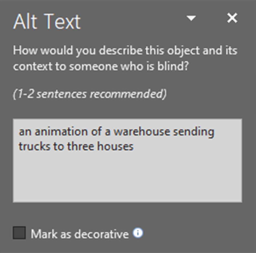
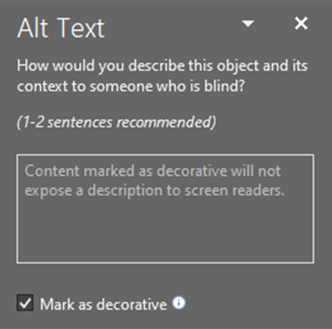
When there are multiple parts of the animation that are redundant but can't be simplified, mark them as decorative if possible or leave their alt text blank and add alt text that describes the animation, or that part of the animation, as a whole.

Fig. 7

Fig. 8

Fig. 9
In this example, the warehouse and houses are one image that has the alt text for the animation: "an animation of a warehouse sending trucks to three houses", and the trucks themselves are marked as decorative.
