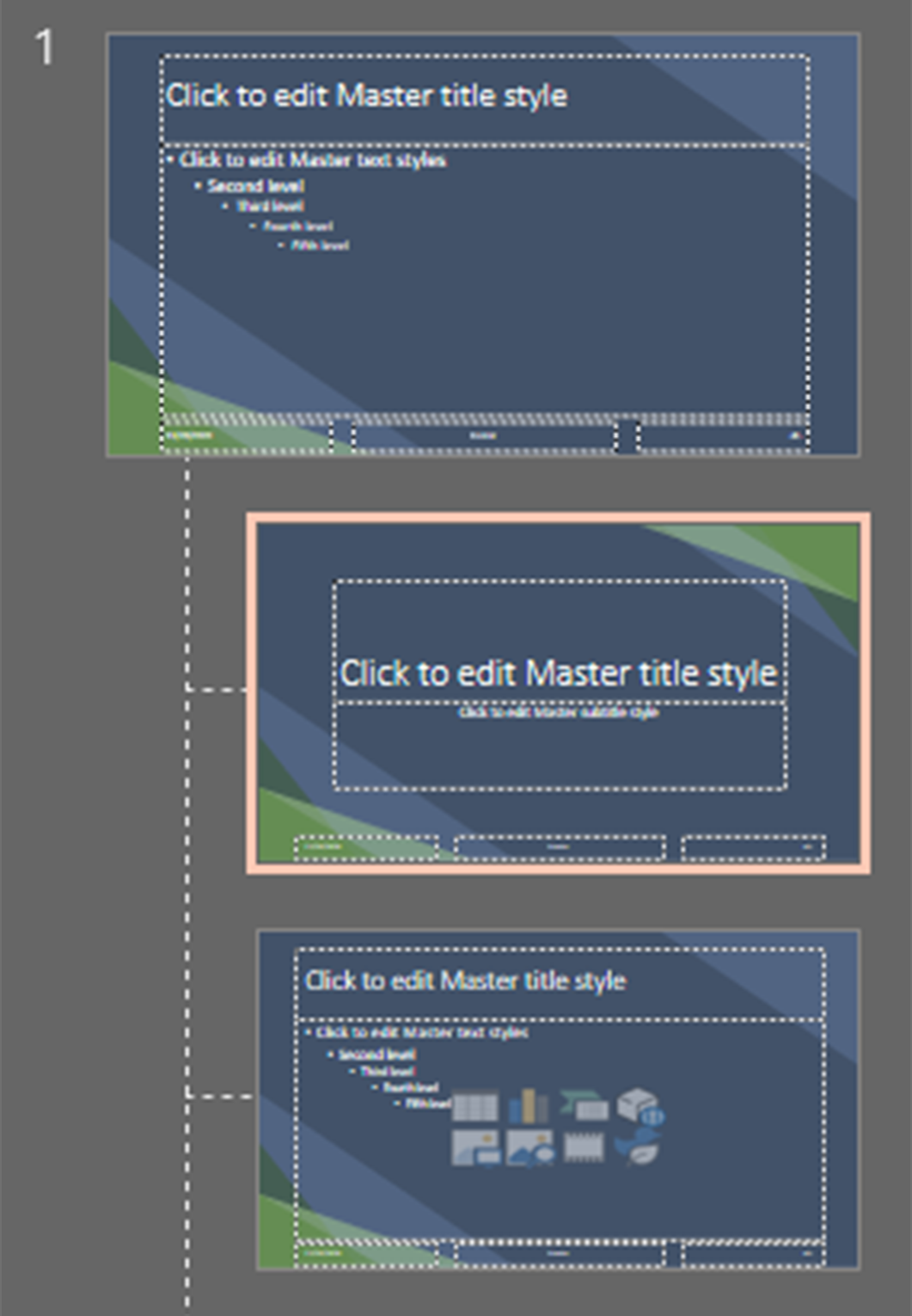
Why use the slide master?
There are two main purposes that the slide master serves when designing PowerPoints to be accessible. The first is creating layouts with more content blocks than the default layouts, and the second is designing a theme. Both are discussed in more detail below
Using slide master for reading order
The slide master is an essential tool for ensuring that every slide element has a dedicated content block to sit in. The importance of content blocks cannot be understated. They allow PowerPoint to accurately recognize each element that needs to be read. Despite this importance, none of Microsoft's default layouts provide more than two content blocks. A good way to remedy this is through the slide master.
Adding content blocks
-
Open slide master
Go to View > Slide Master

-
Duplicate or choose a layout to modify
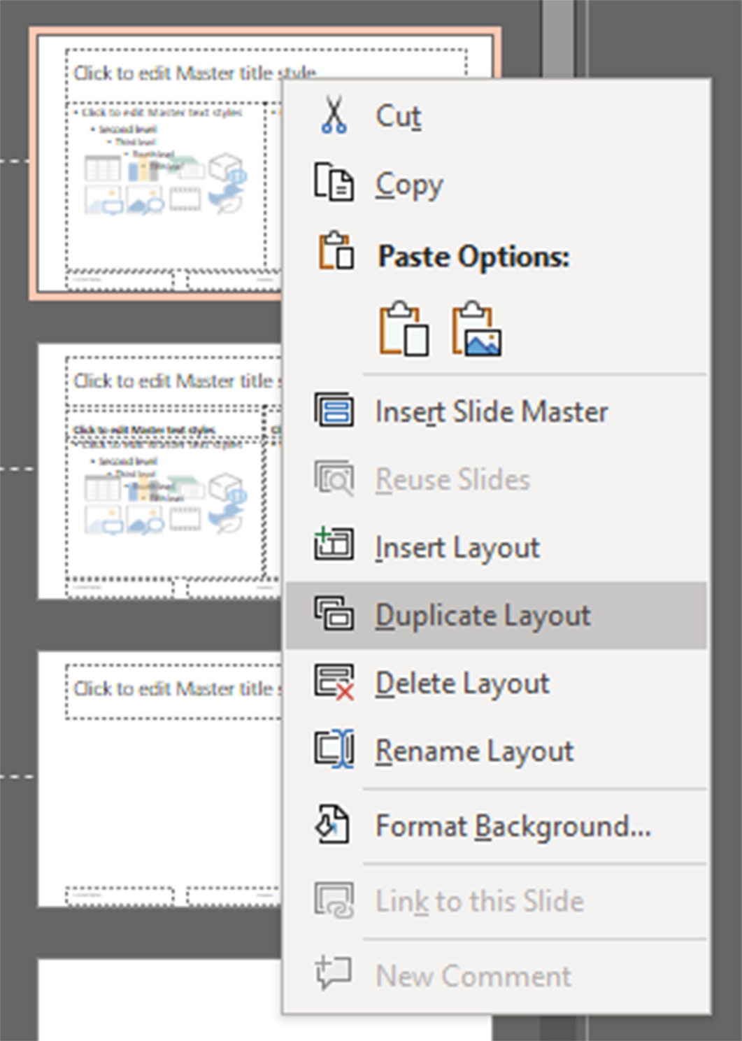
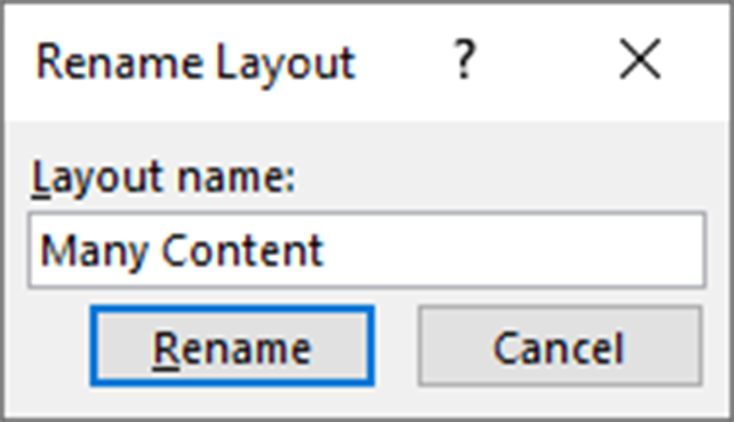
All the layout presets are displayed in the left pane. The top one modifies overall styles, while each of the others corresponds to a layout you can choose when creating a new slide. Choose one as your base for the new slide. If you want to preserve the original, right click on it and choose Duplicate Layout. If you would like to change the name of the layout, you can right click and choose Rename Layout.
-
Add new content blocks
Select an existing content block by clicking on its border and copy and paste it. You can now rearrange the content on the slide to suit your needs. New content blocks will be added to the end of the reading order. For remediating existing presentations, I tend to duplicate the two content layout and add several smaller content blocks so that I can use as many or as few as is needed and rearrange them to preserve the existing content.
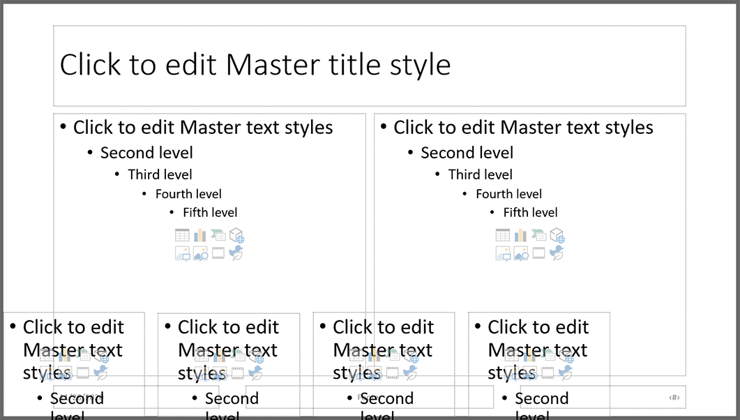
NOTE: It is important when using this method that you double check your reading order in the Selection Pane whenever you use the new layout.
Creating themes
The slide master is the ideal way to apply theming and other distributed stylistic changes. The primary reason for this is that if you were to insert elements like shapes on your slides to add visual interest but not information, they would still be read to a screen reader user and require alt text. If you're listening to the slide show, you probably don't want to listen to "decorative element" repeated for every shape on every slide. Slide master allows you to do this type of theming while keeping those elements off of the reading order, making for a cleaner listening (and editing) experience.
-
Open slide master
Go to View > Slide Master
-
Add common visual elements to the first slide
Because the first slide edits all of the other layouts, this is a good way to apply your theming to all slides in your presentation. Visual elements like inserted shapes won't be added as an element on the slide, but rather simply displayed as part of the background.
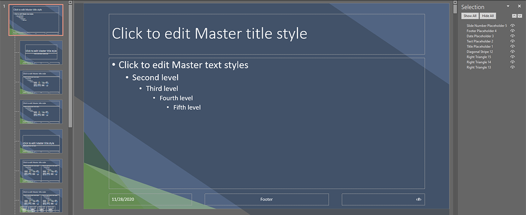
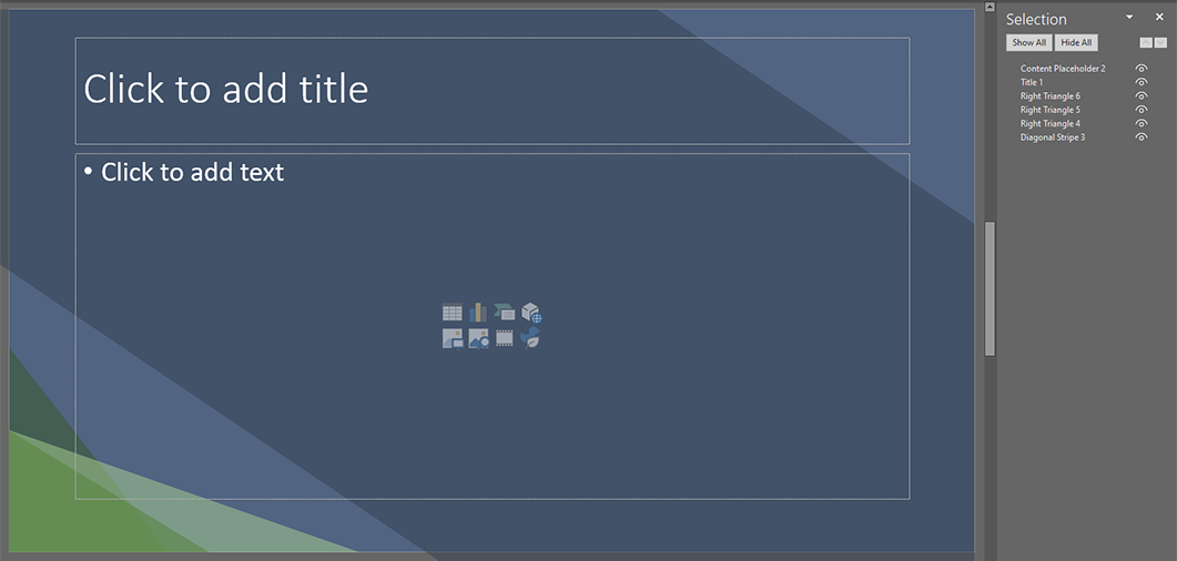
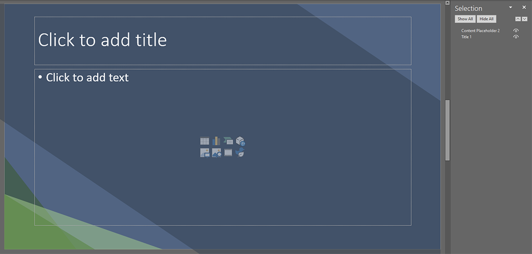
This example demonstrates the difference in the Selection Pane for slides that are decorated directly and those decorated in Slide Master.
-
Add layout-specific theming
After you've done all of the global theming, you can modify specific layouts if you'd like them to have a different style. For example, if you want to add extra elements to your title slide, you can select that layout in slide master and add those elements only to that layout. It's worth noting that you can't remove elements added in the master layout, so the master layout should only contain decorative elements that appear in all other layouts.
